
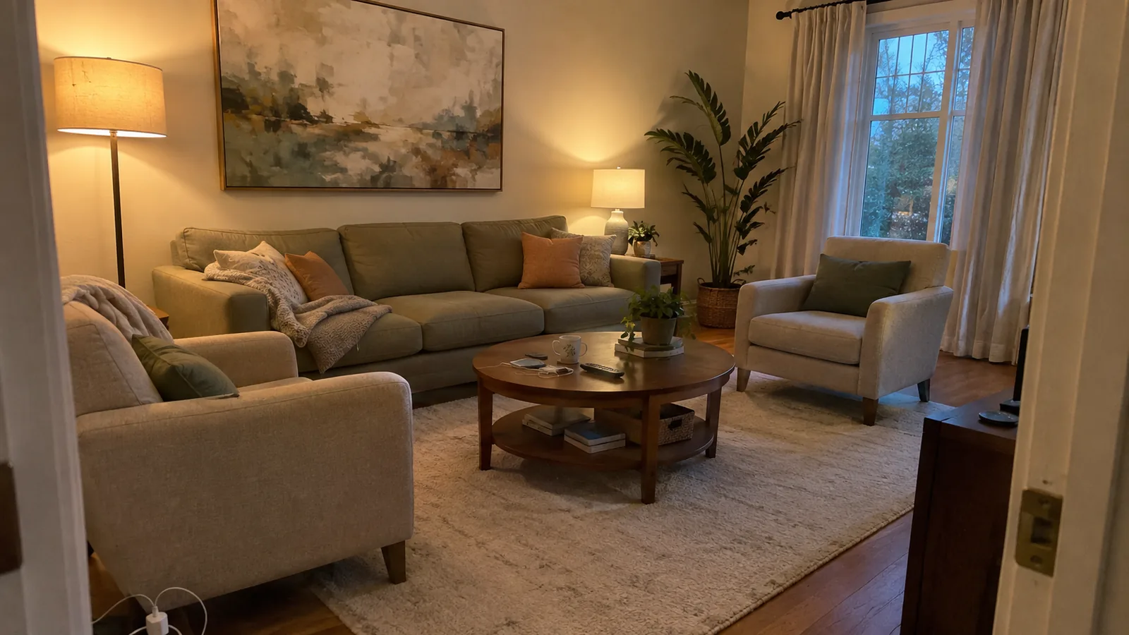
The one-minute check
Before changing anything, stand in the doorway and take a photo of the room on your phone, then look at it in black and white. The photo flattens the room the way a stranger sees it, and removing colour shows you where the weight, the light, and the empty patches really are. Then run down this table.
| What you notice | Likely cause | The fix |
|---|---|---|
| Furniture looks scattered, like it is floating | Rug too small (1) | A rug big enough for the front legs of every seat |
| A big empty patch in the middle of the room | Furniture against the walls (2) | Pull seating into a group |
| Your eye does not know where to land | No focal point, or two competing (3) | Point the seating at one thing |
| The walls look bare even with art on them | Art too high or too small (4) | Lower it, and size it to the furniture below |
| Windows look small and the ceiling low | Curtains too low and narrow (5) | Raise and widen the rod |
| Flat and gloomy at night, harsh by day | Only a ceiling light (6) | Lamps at two more heights |
| One corner looks orange, another blue | Mixed bulb colours (7) | One colour temperature per room |
| Everything sits low; the upper walls are empty | No variation in height (8) | Add two or three tall things |
| Busy but not cohesive, or bland | No colour plan (9) | One main colour, one supporting, one accent |
Most rooms that feel off have two or three of these at once. The numbers below are rules of thumb used by designers and retailers, not codes, but they explain most of the "something is wrong" feeling.
1. The rug is too small
The most common cause by a distance. A small rug sitting in the middle of the floor with no furniture on it reads as an island, and every piece around it looks as if it has drifted away. Designers call this a floating rug, and it is why a room full of good furniture can still look unfinished.
The fix is to size the rug to the seating, not the room. At least the front legs of the sofa and every chair should rest on it, with 12 to 18 in (30 to 46 cm) of bare floor between the rug and the walls. In most living rooms that means 8 x 10 ft, not 5 x 8 ft. Our rug size guide has the sizes for every room and a calculator; if you are between two sizes, choose the larger.
2. Everything is pushed against the walls
Lining the sofa and chairs up along the walls feels like it makes a room bigger. It does the opposite: the seats end up too far apart to talk across, the coffee table is out of reach, and the middle of the room becomes an empty patch that nothing belongs to. The plans below show the same room both ways.
- A30 in (76 cm) from the sofa to the coffee table: too far to reach a drink.
- BAbout 9 ft between the chairs across an empty middle, and a 4 x 6 ft rug that no furniture touches.
- CAn 8 x 10 ft rug with the front of every seat on it holds the group together.
- DA 30 in (76 cm) walkway behind the sofa, so the path runs around the group, not through it.
As a rule of thumb, keep the seats in a conversation group within about 8 ft of each other, and 14 to 18 in (36 to 46 cm) from the coffee table. Leave at least 30 in (76 cm) for a path behind a floated sofa, or 36 in (91 cm) if it is the main route through the room; the furniture clearance guide has the full list. In a truly small room, one long piece against the wall is fine. It is lining up every piece that causes the problem.
3. There is no focal point, or there are two
A room settles when the eye has one obvious place to land: a fireplace, a window with a view, a large piece of art, or the TV. When nothing is dominant, the room reads as a collection of objects. When two things compete, usually a fireplace on one wall and a TV on another, the seating ends up facing neither and the room feels undecided.
Point the main seating at one thing and make that thing the largest or highest-contrast item in view. If you genuinely have two focal points, split the difference with an L-shaped arrangement or a swivel chair. Our living room layout for a fireplace and TV on different walls shows that plan to scale.
4. The art is too high or too small
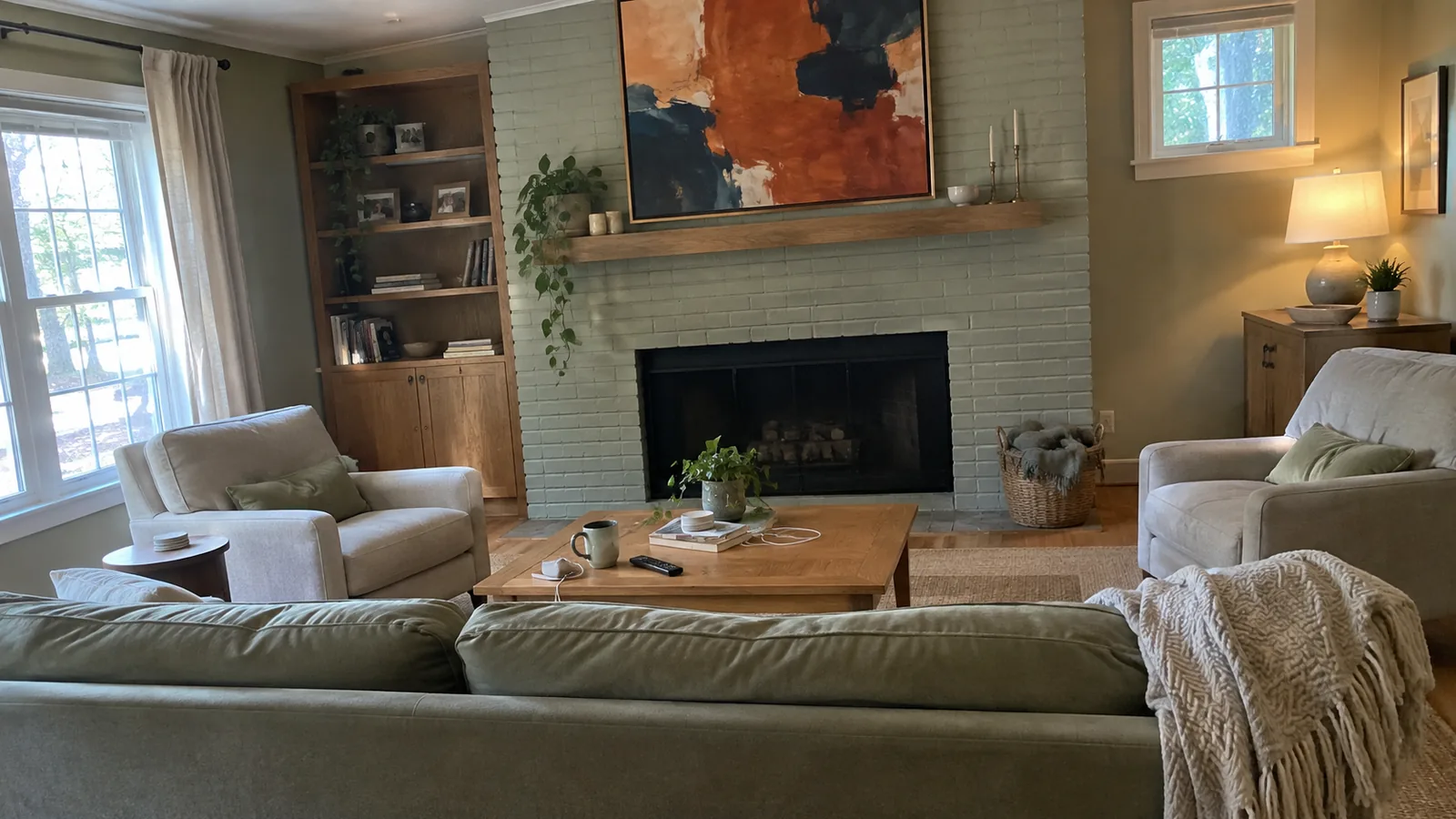
Most people hang art at their own standing eye level or higher, and choose frames that are small for the wall. The result is art that floats near the ceiling, disconnected from the furniture below it, and walls that still look bare.
- Above furniture, leave 6 to 10 in (15 to 25 cm) between the top of the sofa, sideboard, or headboard and the bottom of the frame.
- On a bare wall, hang the centre of the piece at about 57 to 60 in (145 to 152 cm) from the floor, the height many galleries use.
- Size it to the furniture: a single piece or a grouping about two-thirds the width of the furniture below. A gallery of small frames counts as one piece if the gaps are tight, about 2 to 3 in.
5. The curtains are hung too low and narrow
A curtain rod mounted right on the window frame, with panels that cover the glass and stop above the floor, makes the window look smaller and the ceiling lower. It is one of the cheapest fixes on this list: the same curtains on a higher, wider rod change the proportions of the whole wall.
Common rules of thumb: mount the rod at least 4 to 6 in (10 to 15 cm) above the frame, or halfway between the frame and the ceiling; extend it 8 to 12 in (20 to 30 cm) past each side so the open panels stack on the wall, not the glass; and choose a length that just touches the floor. For fullness, the combined panel width should be about 1.5 to 2 times the window width. Measure before you buy, because standard 84 in panels are often too short once the rod goes up.
6. All the light comes from the ceiling
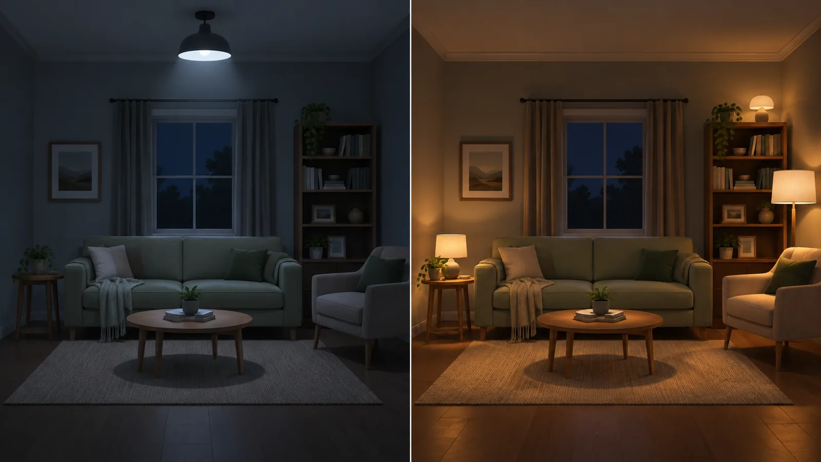
A single ceiling fixture lights the floor and the tops of things, leaves the walls and corners dim, and casts shadows under every face. In the evening it makes even a well-furnished room feel flat and a little institutional. Designers solve it by layering light from several heights.
- Ambient: the general light, from the ceiling fixture or from several lamps together.
- Task: light where you read or work, such as a floor lamp beside a chair.
- Accent: light that picks out something, such as a lamp on a sideboard, a picture light, or an uplight behind a plant.
A practical target for a living room is at least three light sources at different heights, spread around the room so no corner is dark: one low (a table lamp), one at seated head height or above (a floor lamp), and the ceiling light on a dimmer. Put them on in the evening before deciding the room needs new furniture; it often does not.
7. Every bulb is a different colour
LED bulbs come in different colour temperatures, measured in kelvin (K). A room with a 2700 K lamp in one corner and a 5000 K bulb in the ceiling looks patchy, orange in one place and blue in another, and it undermines every colour you chose for the walls and fabrics. It is also invisible in daytime photos, which is why people often miss it.
| Colour temperature | Usually sold as | How it looks | Where it works |
|---|---|---|---|
| 2700 K | Warm white, soft white | Warm, like an incandescent bulb | Living rooms, bedrooms |
| 3000 K | Soft white, warm white | Warm but slightly crisper | Living rooms, kitchens, bathrooms |
| 3500 to 4000 K | Neutral, cool white | Neutral to slightly cool | Home offices, garages, task lighting |
| 5000 K and above | Daylight | Bluish white | Workshops, not usually living spaces |
Pick one temperature per room, usually 2700 or 3000 K for living spaces, and replace any bulb that does not match. Check the kelvin number on the box rather than the name, because "soft white" and "warm white" mean different things to different brands.
8. Everything is the same height
Most living room furniture sits below about 36 in (91 cm): the sofa back, the chairs, the coffee table, the side tables, the TV console. If nothing rises above that line, the room has a low, flat skyline and a band of empty wall above it, and it feels unfinished no matter how nice the pieces are.
These are typical heights, not standards; check your own pieces. The fix is two or three vertical elements spread around the room: a floor lamp, a tall plant, a bookcase or tall cabinet, art hung as described above, or curtains taken up towards the ceiling. Spread them out, one per wall or corner, so the height is balanced rather than all on one side. If pieces look wrong in scale relative to each other rather than just low, our guide to why rooms look wrong in real life covers how size misleads online.
9. The colours have no plan
A room can feel off in two opposite ways: busy, because every piece brought its own colour, or bland, because everything is the same beige. Both come from having no plan for where colour goes. A widely used starting point is the 60-30-10 rule: about 60 percent of what you see in one main colour (usually walls and large surfaces), 30 percent in a supporting colour (the sofa, curtains, or rug), and 10 percent in an accent (pillows, art, a vase).
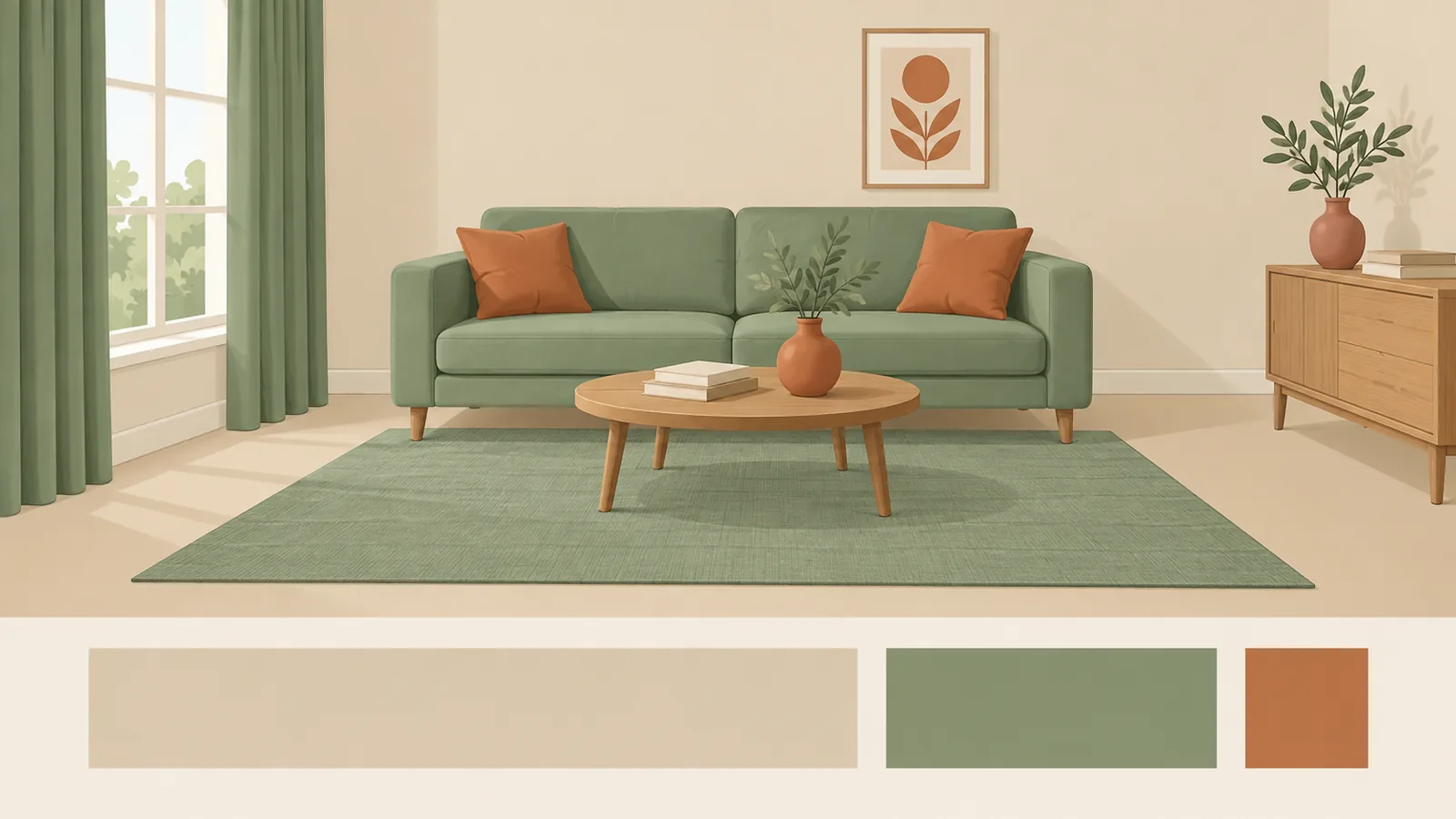
It is a rule of thumb, not a formula. What matters is repetition: an accent colour that appears three times, in different places, looks intentional, while the same colour used once looks like an accident. Wood counts as a colour too. If you have several wood tones, repeat each one at least twice rather than letting one piece stand alone.
Fix it in this order
Work from the cheapest, biggest changes to the smallest. Most rooms are fixed by the first four steps.
- Move what you have. Pull the seating into a group and point it at one focal point. It is free and it is the largest single change.
- Fix the light. Match the bulbs, then add a lamp or two so the room has light at three heights.
- Rehang. Lower the art, raise and widen the curtain rod. An afternoon with a drill.
- Resize the rug if no furniture sits on it. This is usually the first purchase worth making.
- Add height and repeat colours with a plant, a lamp, or a bookcase, and accents that appear in at least three places.
Before buying anything large to fill a gap, tape its footprint on the floor and live with it for a day. If the room still feels off after the layout, the light, and the rug are right, see our room layout planning guide before you order.