
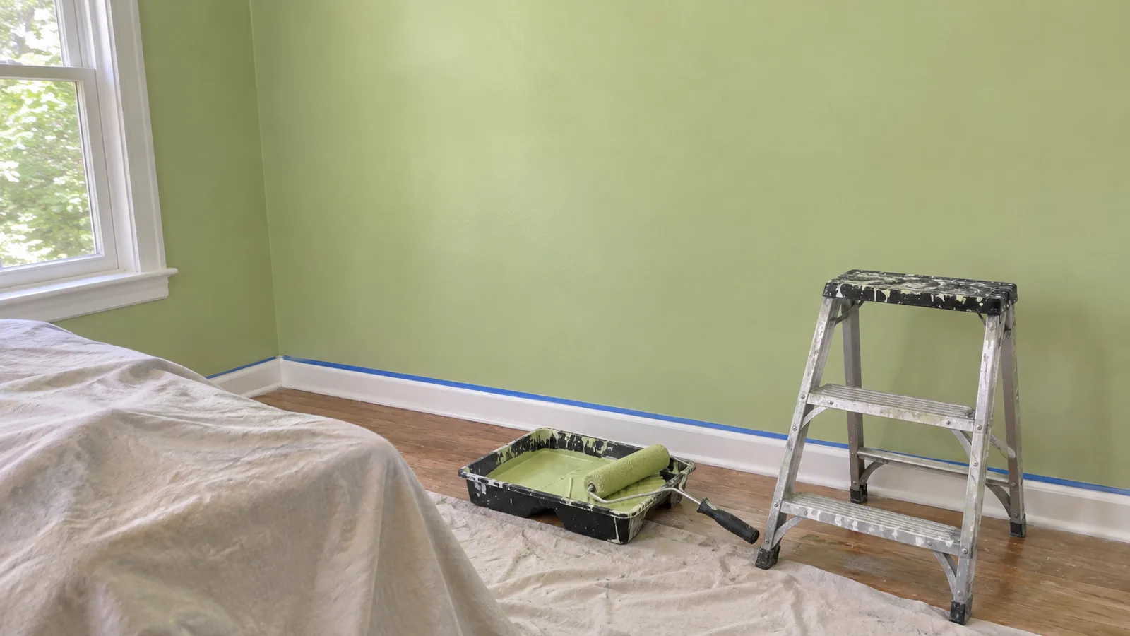
The five big 2027 picks at a glance
There is no single 2027 color of the year: each brand names its own. The five below are the picks from the largest US paint brands. Sherwin-Williams' Celery is the only light one. Webster Green, Artifact and Cottage Door sit in the middle, and Behr's Grounded is dark enough to treat as a deep accent.
| Brand and color | Code | LRV | What the brand calls it | Announced |
|---|---|---|---|---|
| Sherwin-Williams Celery | SW 6421 | 71.3 | "An airy, herbal green" with subtle yellow undertones | 15 Sept 2026 |
| Benjamin Moore Webster Green | HC-130 | 20.2 | "A confident hue with inherent character" | 14 Oct 2026 |
| Behr Grounded | T27-01 | 11 | "An earthy olive green" with brown undertones | 26 Aug 2026 |
| Valspar Cottage Door | 8004-38E | 26 | Blue family, cool undertone | First of the five |
| Glidden Artifact | PPG10-16 | About 21 | "A calm, fresh aqua" | 14 Sept 2026 |
LRV and hex values come from the brands' own colour pages: Sherwin-Williams, Benjamin Moore, Behr's Canadian colour page for Grounded, Valspar and Glidden. Behr's own announcement gives the date for Grounded. Announcement dates for the others come from the brands' press releases as collected by the Kooihaus tracker, and Valspar's place as the first to announce comes from Young House Love's list. Glidden's page shows Artifact as RGB 105, 128, 139, and PPG lists its LRV as 21. Other databases round it to 20.
How light or dark each one is
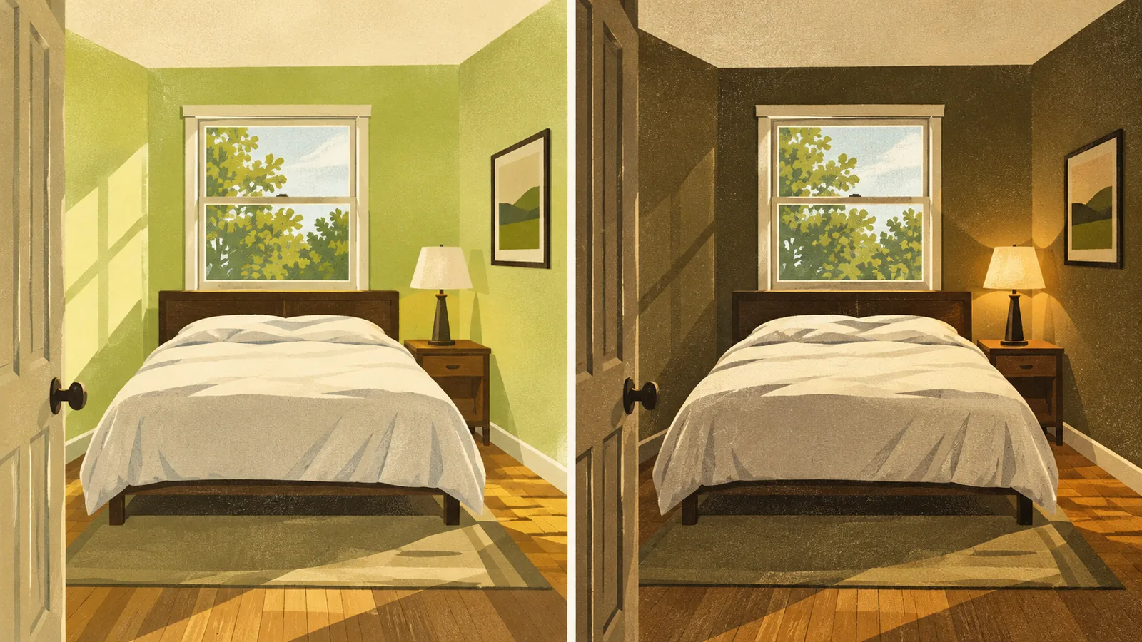
Light reflectance value (LRV) is the share of light a colour reflects, on a scale where 0 is black and 100 is white. It is the quickest way to tell how a colour will behave on a whole wall, because a low-LRV colour makes a room darker even when the swatch looks mid-toned. These five span most of that range.
As a rough guide, colours above about 60 behave like light wall colours, colours in the 20s behave as mid-tones that darken a room noticeably, and colours below about 15 behave as deep accents. That guide is ours and is a rule of thumb, not an industry standard. Daylight, sheen and the size of the wall all shift how a colour reads.
Three greens, three different jobs
Celery, Webster Green and Grounded are all called green, but they would sit in very different places in a house. Sherwin-Williams describes Celery as a soft, muted green "with subtle yellow undertones" that balances "an airy pastel and a grounded, herbal hue." With an LRV of 71.3 it is a whole-room colour, and the yellow undertone is the thing to test: in warm evening light it may lean toward cream, and in cool north light it may look greyer.
Benjamin Moore calls Webster Green "a confident hue with inherent character, this quintessential green is both adaptable and impactful." At LRV 20.2 it is a true mid-tone. It suits a room with good daylight, a study, or a full color drench where you want the room to feel enclosed. Behr describes Grounded as a colour that "moves effortlessly between olive and moss, anchored by subtle brown undertones," and suggests it for living rooms, kitchens and exteriors. At LRV 11 it is the darkest of the five, so on four walls of a small room it will feel heavy. On cabinets, an island, a door or one wall, it works as an anchor.
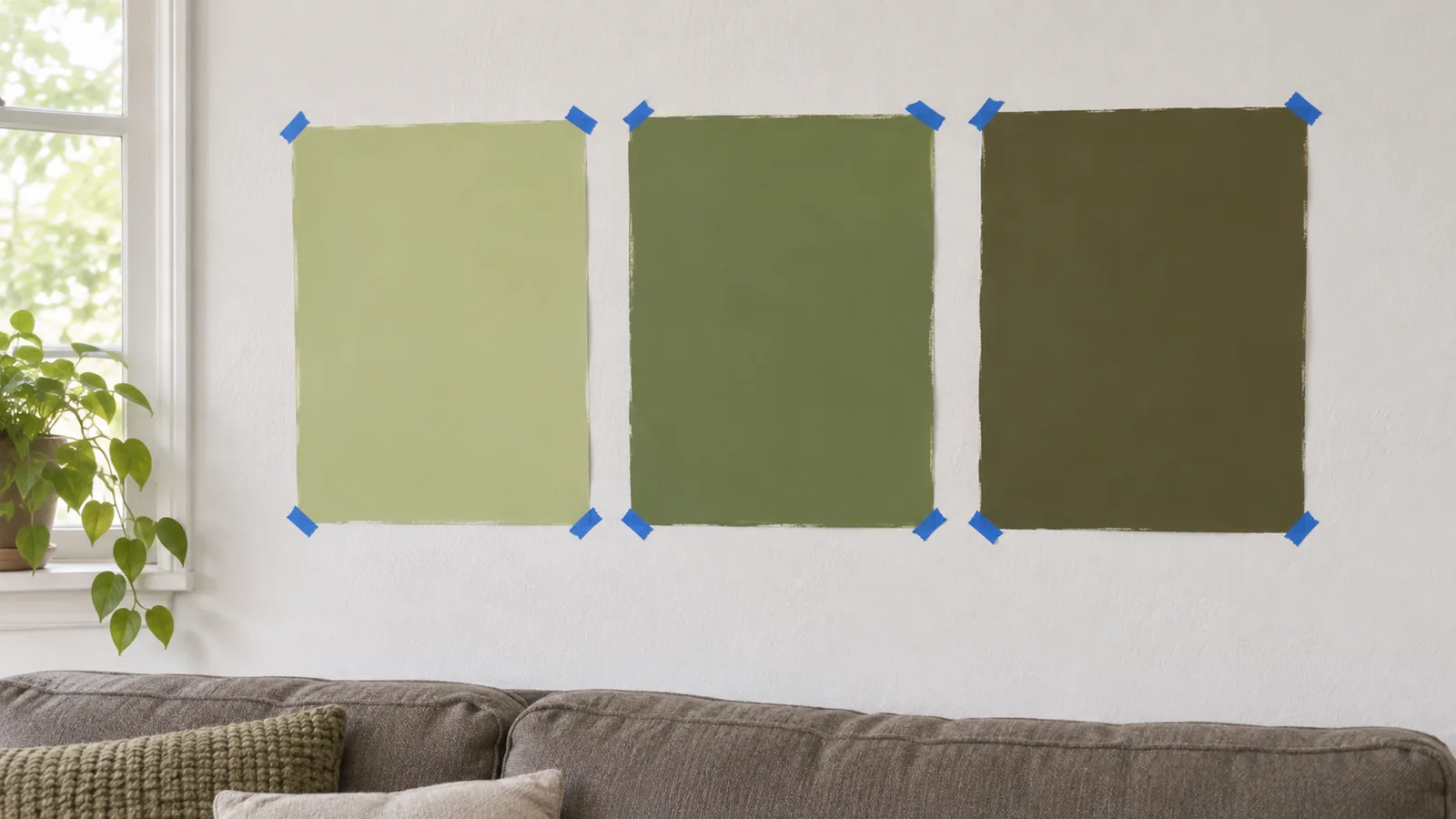
| Green | Depth | Undertone | Best use |
|---|---|---|---|
| Celery | Light (71.3) | Yellow | All four walls, dim rooms, kitchens with white cabinets |
| Webster Green | Mid (20.2) | Balanced green | Studies, dining rooms, a drenched room with good daylight |
| Grounded | Dark (11) | Brown olive | Cabinets, islands, doors, one wall, exteriors |
Two smoky blues: Cottage Door vs Artifact
Valspar's Cottage Door and Glidden's Artifact are close cousins. Their hex codes are only a few steps apart, and their LRVs are 26 and about 21, so Artifact is a little deeper. Valspar files Cottage Door in its blue family with a cool undertone, and Glidden calls Artifact "a calm, fresh aqua," which hints at a little more green in it. Seen side by side, the blue in Cottage Door should read slightly lighter and greyer, and Artifact slightly deeper and more teal. That comparison is our reading of the published values, not a test.
Both are mid-tones, so they behave like Webster Green on a wall: they will darken a room more than the chip suggests. They suit bedrooms, bathrooms with a white tile base, and painted furniture. If you are choosing between them, put both samples on the same wall and look at them in the morning and after dark.
What each brand pairs it with
Each brand publishes a palette around its pick. These are the brand's own suggestions, useful as a starting point for trim, ceilings and an adjoining room.
| Pick | Brand's companion colors |
|---|---|
| Celery (SW) | Part of Sherwin-Williams' Colormix Forecast 2027 collection of coordinating hues |
| Webster Green (BM) | White Down OC-131, Nelson Blue CW-635, Shakespeare Tan 228, Antique Copper 1169, Wild Aster 1240, Durango 2137-30, Townsend Harbor Brown HC-64 |
| Grounded (Behr) | Seven returning colors: Coastal Beige, Wheat Grass, Environmental, Denim Light, Smokey Claret, Sarsaparilla, Mozart |
| Cottage Door (Valspar) | Coordinating colors listed on its page: Summer Gray, Slate Court, Blue Fescue |
| Artifact (Glidden) | Airy, Smoky Slate, Autumn Fern, Toffee Crunch, Clam Shell, Capuccino, Juniper Berry, Carob Chip, Warm Mahogany |
A pattern runs through all five palettes: warm off-whites, tans and browns rather than bright white and cool grey. If your trim is a stark cool white, test it beside the new colour, because a warmer trim white may sit better with Celery or Grounded.
Test it in your own light before you buy
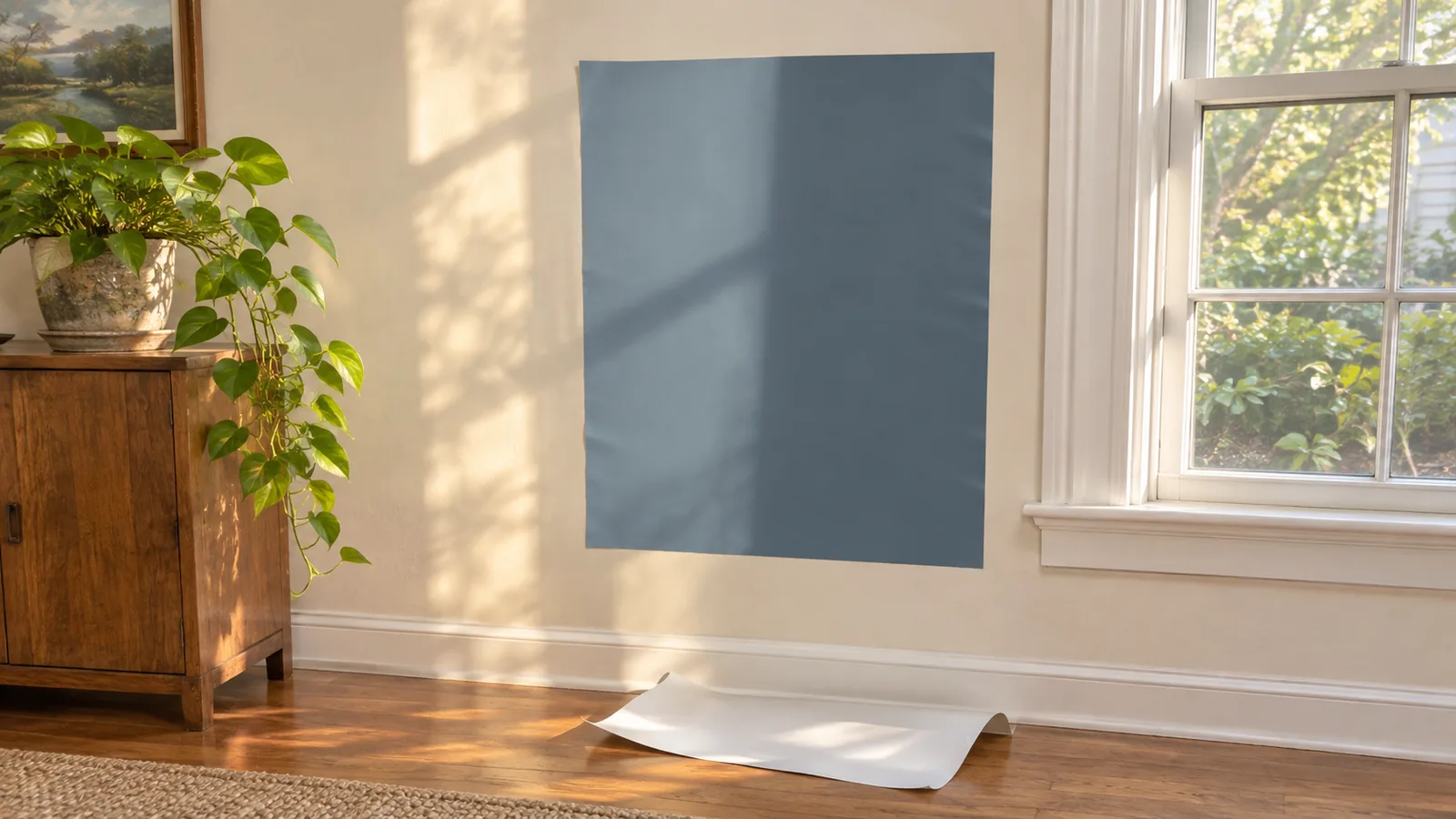
A 2027 colour you saw on a screen or a chip can look quite different on your wall. Daylight direction, bulbs, the floor colour and the sheen all change it. The cheapest test is also the most reliable: a large sample on the wall you will paint, checked at different times of day.
- Go large. Use a peel-and-stick sheet or paint a board at least the size of a sheet of paper. Small chips exaggerate how light a colour is.
- Test on more than one wall. A sample on the window wall sits in shadow; one opposite the window gets the full light.
- Check morning, afternoon and lamp light. Yellow-leaning Celery and brown-leaning Grounded shift the most under warm bulbs.
- Hold it against your trim and floor. The fixed colours in a room decide whether a new colour works.
- Test the finish you will use. Our matte vs eggshell vs satin comparison explains why the same colour looks darker and richer in a higher sheen.
A paint colour visualizer app is a quick way to narrow five colours to two, but it cannot replace a real sample, because a phone screen does not show the paint.
Every other 2027 color of the year
Beyond the five above, more than a dozen brands have named a 2027 colour. We checked the five major picks on the brands' own pages. The picks below were announced by each brand and collected by the Kooihaus tracker (updated 3 November 2026) and Young House Love. The descriptions are the brands' own, paraphrased.
| Brand | 2027 pick | Color family |
|---|---|---|
| HGTV Home by Sherwin-Williams | Celery SW 6421 (same as Sherwin-Williams) | Light yellow-green |
| Dulux (AkzoNobel) | Soulful Sage | Soft grey-leaning green |
| Clark+Kensington (Ace) | Vantage Point 38B-4 | Medium-to-deep blue |
| California Paints | Quiet Peace | Deep moody blue |
| PPG (global) | Country Soil PPG15-30 | Warm beige-taupe-grey |
| Dunn-Edwards | French Press Coffee DEBN07 | Deep brown with a plum undertone, LRV 6 |
| Little Greene | Marle 355 | Mid-tone ochre brown |
| Dutch Boy | Deep Rooted 311-7DB | Earthy terracotta orange |
| C2 Paint | Pueblo C2-510 | Earthy mauve |
| Rust-Oleum (wall paint) | Mauve Classic RO1130 | Warm smoky mauve |
| Graham & Brown | Rose Earth | Warm clay pink |
| Minwax (wood stain) | Pickled Oak MW260 | Light stain that keeps the grain visible |
| Pantone | Not announced as of 17 November 2026 | Usually named in early December |
Which 2027 color fits your room
| If you want to | Start with | Why |
|---|---|---|
| Brighten a dim room | Celery | By far the highest LRV of the five |
| Paint cabinets, an island or a front door | Grounded | Deep and earthy, and Behr suggests kitchens and exteriors |
| Drench a study or dining room | Webster Green | A mid-tone that wraps a room without going black |
| Calm a bedroom or bathroom | Cottage Door or Artifact | Muted, smoky blues; Artifact is a little deeper |
| Add one accent wall | Grounded or Webster Green | Enough contrast against a light neutral |
If you are deciding between one wall and the whole room, our color drenching vs accent wall comparison works out how much paint each plan needs. For a wider look at what is changing in 2027 beyond paint, see our 2027 home decor trends guide, which also rates which trends are likely to last.