
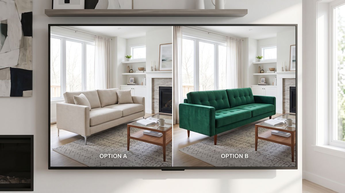
Why furniture comparisons usually go wrong
Most shoppers compare furniture in the worst possible environment: several open tabs, different product photography styles, different room setups, and a memory of how each piece felt. That makes one product look warmer, another look bigger, and another feel more expensive, even when the differences are mostly presentation.
The result is not a real comparison. It is a rotating sequence of impressions.
How to build a shortlist that is actually usable
- Start broad, but narrow fast. Do not compare ten pieces seriously.
- Remove anything that clearly fails on budget, room reality, or material preference.
- Keep only the two or three options you would genuinely buy today.
- Collect clean product images for those finalists.
The point is not to build the perfect research spreadsheet. It is to get to a final comparison set quickly enough that you still make a decision.
How to compare the finalists the right way
Use one room photo, one angle, and one consistent set of criteria: visual bulk, color compatibility, style fit, and confidence level. When the room stays constant, the differences between the products become much clearer.
This is where a room-based preview becomes especially valuable. It lets you stop comparing listings and start comparing outcomes.
Best final check before buying
Once you have the finalists, run them through the same room-preview workflow in the same room image. That makes the decision easier because you are now evaluating what the product does in your space, not how persuasive the listing page looks.
The best comparison process is the one that gets you from �maybe� to one clear winner. A visual shortlist test is usually the most useful final step.